Traahn
User

Posts: 3,305 | Re: TRON Font [A Question]
on Friday, July, 21, 2006 12:36 AM
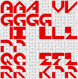
Here's a black & white version of mine. I had only done the stylish version before for fun, but just realized you maybe thought I was intending to have a purple haze as part of my font :P
 order abortion pill morning after pill price where to buy abortion pill
    
I'm getting out of here right now, and you guys are invited.   -----^ -----^
|
Qix77
User

Posts: 2,992 | Re: TRON Font [A Question]
on Friday, July, 21, 2006 1:03 AM
This is such an awesome thread... I'm soooo surprised that I missed it...
Another reason to add to my list why I love you guys soooo much.
If anyone can put these fonts (or all of them) in a TTF format, please give me a heads up... I only have one TRON font on my computer.abortion pills online http://www.kvicksundscupen.se/template/default.aspx?abortion-questions cytotec abortion
|
Tori
User

Posts: 0 | Re: TRON Font [A Question]
on Friday, July, 21, 2006 1:03 AM
That's cool looking. I used to have TRON font at some point on my computer...used it once...and then got a new memory thing (The name escapes me at the moment.). Most of the stuff I used to have was deleted.  where to buy abortion pill abortion types buy abortion pill online
==
|
wwwmwww
User

Posts: 1,231 | Re: TRON Font [A Question]
on Friday, July, 21, 2006 9:39 AM
Traahn Wrote:Here's a black & white version of mine. I had only done the stylish version before for fun, but just realized you maybe thought I was intending to have a purple haze as part of my font :P
|
No, I understood the shapes and realized the purple haze was just there for effect. I also really like many of your letters. The A, C, D, G all look very nice but some of the angled cuts make me think more along the lines of a TRON 2.0 font then an original TRON font not that that is a bad thing. I also really like your Q, I may have to think about that one as I may like it even more then mine. The B and the P look too angular to me. I think the B should look similiar to the 8 and the P should look more like the R. I tend to think the W should follow the same pattern as the M and N. The 2 letters that bother me the most are the V which uses some smaller triangles then those shown in my interpretation of the rules shown on page 2 and the Z which I think just looks odd.
Carl
|
Traahn
User
Posts: 3,305 | Re: TRON Font [A Question]
on Friday, July, 21, 2006 11:22 AM
Thanks for the feedback, Carl. I've actually had issues with my B, P and Z. And I'm not incredibly fond of V and W (especially not W), but I did not want to overuse the M and N style (e.g, for W and Z). That seemed like it would be an over-used, cheap way out to me; I wanted more variety. Good observations. Interesting take on how it looks Tron 2.0'ish... I'd have to agree, even though that wasn't my aim. I might go back in and tweak the letters I find particularly weak. Thanks for the observations ~order abortion pill abortion pill buy online where to buy abortion pill
I'm getting out of here right now, and you guys are invited. -----^
|
zook_one
User

Posts: 278 | Re: TRON Font [A Question]
on Friday, July, 21, 2006 12:28 PM
Okay this is my source file, It has pretty much every variant I produced contained. Its a Flash file so you can right click and zoom in and then pan around... pretty cool.
order abortion pill abortion pill buy online where to buy abortion pill
[LDSO] LIVING DEAD SYSTEM OPERATORS www.LDSO.net
|
wwwmwww
User
Posts: 1,231 | Re: TRON Font [A Question]
on Friday, July, 21, 2006 2:53 PM
Ok... here are some letters I'm trying to make my mind up about. There are just so many ways some of these letters can be made and I'd REALLY like to see the way Syd did it and be done with it. Anyways let me know what you think is the best of these:
Here are some of my thoughts.
1) Should the use of the arc be reserved for letters with smooth curves? If so it probably shouldn't be used in the A as an A typlically looks like an upsidedown V with a line through it. That said I still like the one that does use the arc.
2) Well if I change the V then I think I can lose the arc on the A and it still look ok.
3) There are just so many ways to make a good G. However I think I like a modified Traahn G the best.
4) Should all the letters be 4 squares wide? If so the other I doesn't look that bad but considering the numberal 1 is only 2 squares wide I think I still like the other one.
5) I tried a few different L shapes and then it hit me I could tie its shape to the E and F.
6) I still like both Qs and I'm right on the fence with this one.
7) I think maybe the P and the R should be changed to better match the style of the K. If this change is made that maybe the B and the D should be changed as well.
After all the above changes here is what I have so far:
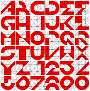
Is this an improvement? I'm curious what others think.
Thanks,
Carl
|
wwwmwww
User
Posts: 1,231 | Re: TRON Font [A Question]
on Friday, July, 21, 2006 3:07 PM
| Traahn Wrote:but I did not want to overuse the M and N style (e.g, for W and Z). That seemed like it would be an over-used, cheap way out to me; I wanted more variety. |
Well personally the more things that can be kept common among the letters the more unified the font looks to me. I viewed that as a good thing. Atleast I don't view it as the "cheap" way out.
| Traahn Wrote:Thanks for the observations ~ |
You're welcome. I'm having quite a bit if fun with this myself.
Carl
abortion pills online http://www.kvicksundscupen.se/template/default.aspx?abortion-questions cytotec abortion
|
wwwmwww
User
Posts: 1,231 | Re: TRON Font [A Question]
on Friday, July, 21, 2006 4:15 PM
| zook_one Wrote:Okay this is my source file, It has pretty much every variant I produced contained. Its a Flash file so you can right click and zoom in and then pan around... pretty cool. |
Cool... I was working on my post while you posted this. Lots of nice varients I hadn't considered and a very cool way of posting them. I don't know how to make a flash file let alone post it in a way that's interactive.
Carl
|
Traahn
User
Posts: 3,305 | Re: TRON Font [A Question]
on Friday, July, 21, 2006 5:47 PM
You'd need Macromedia Flash, I'm pretty sure. That's the only way I know to make those files...
I'm getting out of here right now, and you guys are invited. -----^
|
Sketch
Sector Admin
Posts: 2,939 | Re: TRON Font [A Question]
on Friday, July, 21, 2006 7:46 PM
Very cool designs. 
Man, I hope to contribute some. Looks like fun. Trying to stay focused on some drawings at the moment. Got alot of inking to do. I've done some designs myself for the Tron letter forms a while back. It's kinda old now. Will try and post them when I get the chance.
https://www.flickr.com/photos/blue_bezel/
|
scarletguard
User

Posts: 4 | RE: TRON Font [A Question]
on Tuesday, December, 21, 2010 10:53 PM
The credits for Tron Legacy appears to use the font style from the logo for the original movie. Might this font make its way towards release?
|
|